Showing posts with label data. Show all posts

Thursday, April 7, 2016

Why Won't My Tests Scan Correctly? (Data Director FAQ)

Data Director FAQ #3: When I scan my answer sheets, all of the answers and student ID numbers are wrong. How do I fix it?


There is more than one answer to this question, because there a number of steps in the Data Director assessment process that could be causing the problem.


Issue #1: Printing


When you print, you should check the "Fit to Page" box in the printing dialogue.


Your answer sheets have registration T marks at the top and bottom. These T marks help the scanner identify where to locate the bubbles that it needs to scan. When printed correctly, these T's are approximately 1/4" from the sides and 1/2" from the top and bottom of the answer sheet. If "Fit to Page" hasn't been checked, the T's will be too close to the edge.

Answer sheet printed correctly with "Fit to Page" option checked.


Answer sheet printed incorrectly without "Fit to Page" option checked. Note how much closer the T's are to the edge of the page.


Issue #2: Scanning


Even if you did print your answer sheets correctly, your answer sheets may not scan correctly. This is most likely because the person who scanned before you had to calibrate the scanner for incorrectly printed answer sheets, but didn't reset it when finished.

The solution is to calibrate the printer, so that it correctly identifies where your students' answers are on their bubble sheets according to the registration T marks at the top and bottom of the page.

To calibrate the printer, follow the directions below, or go to the directions I've shared on Google Drive.

Thursday, March 3, 2016

Strike Up the (Proficiency) Bands! (Data Director FAQ)

Data Director Frequently Asked Question #2: Why are the percentages on the pre-test proficiency bands different than the post-test proficiency bands?


Proficiency bands in Data Director are not just visual representations of how your students performed on an assessment; they are a useful tool in terms of making MTSS (multi-tiered systems of support) decisions to enhance your students' learning.

The main reason that the proficiency bands change from the pre-test to the post-test in Data Director is because the data from those tests are used in different ways.

Unit pre-tests are formative assessments designed to guide instruction during the unit. The color bands indicate what sort of instruction the students within each level will need.


Starting in the middle, the students in the yellow Core band (students who scored between 69-79% on the pre-test) are the students who are ready for regular instruction during the unit. In other words, these are the students whose prior skills and knowledge make it likely that they'll be proficient at the end of the unit without extra support beyond your regular instruction.

Above them are the green Enrichment band for students who scored between 79-89%, and the blue Enrichment+ band for students who scored above 89%. These students have already demonstrated proficiency on the knowledge and skills that will be taught throughout the unit; they are ready for enriched instruction above and beyond what is normally taught during the unit.

Students in the orange Core+*classroom support* band scored between 49-69% on the pre-test. These students may need extra support beyond regular classroom instruction to become proficient by the end of the unit. Students in the red Intensive Core+ band scored below 49% on the pre-test, and will definitely need extra support throughout the unit in order to bring their knowledge and skills up to proficiency for the post-test.

Unit post-tests are formative assessments designed to guide re-teaching after the unit. The color bands indicate your students' proficiency on the knowledge and skills taught throughout the unit. For students who aren't proficient at the end of the unit, the bands indicate how much re-teaching they will need to reach proficiency.


Students in the green Proficient band (79-99%) and the blue Advanced band (at least 99%, which essentially means a perfect score for our unit post-tests) have demonstrated their proficiency on the skills and knowledge taught during the unit, and are not in need of any re-teaching.

Students in the remaining three bands need some sort of re-teaching to reach proficiency. In the yellow Close to Proficient band (69-79%) are students who probably don't need much re-teaching in order to demonstrate proficiency for the unit. On a 20-question post-test, a student in the yellow band only needed one or two more correct answers to make it to green.

Students in the orange Needs Additional Intervention band (49-69%) and the red Needs Substantial Intervention band (49% and below) will need more help to reach proficiency. These are students with significant gaps in their understanding of the skills and knowledge taught throughout the unit, and will likely need a considerable amount of re-teaching in order to become proficient.

One of the best ways to ensure that more of your students reach proficiency on the post-test is to formatively assess their skills and knowledge throughout the unit, and then use the information gained from those formative assessments to guide your instruction. Regular formative assessments that are connected to the Iowa Core standards that your students are working on will keep you better informed on their progress throughout the unit, and will make it easier for you to meet their individual learning needs in your classroom.

Wednesday, February 11, 2015

Data Celebration: Statistics and Probability in 6th Grade Math

One of my goals for the second half of the 2014-2015 school year is to use this blog to celebrate some of the growth we can see through our student data at Southeast Polk. I'll kick off those celebrations with the growth we've seen from our sixth grade math students in the area of statistics and probability.

For the past three years, our sixth graders have been assessed on four statistics and probability standards:
  • MA.6.6.SP.1 Recognize a statistical question as one that anticipates variability in the data related to the question and accounts for it in the answers.
  • MA.6.6.SP.2 Understand that a set of data collected to answer a statistical question has a distribution which can be described by its center, spread, and overall shape.
  • MA.6.6.SP.4 Display numerical data in plots on a number line, including dot plots, histograms, and box plots.
  • MA.6.6.SP.5 Summarize numerical data sets in relation to their context.

AVERAGE SCORES

The average scores of our sixth grade math students rose in all four students, including a jump of 14 percentage points from last year in standard SP.2.

PROFICIENCY LEVELS

Last year, sixth grade math students met our district proficiency goal by scoring at least 80% in only two of the four statistics and probability standards. This year, they met that goal in all four standards, including a fantastic leap from 52% to 83% of our students testing proficient for standard SP.2.


STUDENTS WITH IEP's

Another impressive gain was made by our special education students. Last year, only one-third of IEP students tested proficient in unit 5, where all four statistics and probability standards were assessed. This year, 44 out of 55 IEP students scored at least 80% on the unit 5 post-test. 

Sixth grade math students include most of the students at Spring Creek, as well as 35 accelerated fifth graders. 

Monday, December 8, 2014

Data Teams and the Debate Over the College Football Playoffs

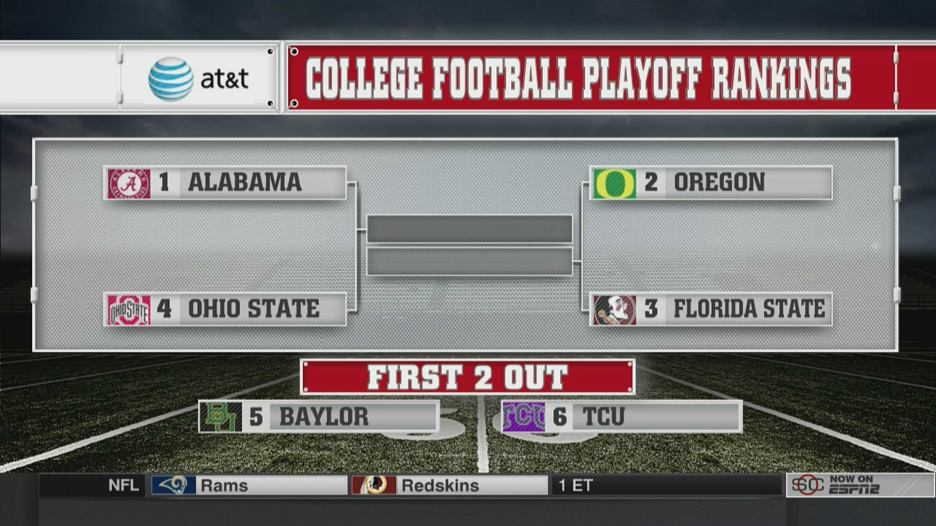
On Saturday, as the college football regular season was winding down and Twitter was flooded with arguments about which teams should and should not be selected for the first NCAA FBS playoffs, I sent out the following tweet:


It turns out that the selection committee for the 4-team playoff does have a protocol for choosing teams, and it's been public since before the season started. It's not exactly a rubric aligned to standards, but it does contain specific criteria for committee members to consider. From what I can see, the committee followed their own rules perfectly when they selected Alabama, Oregon, Florida State, and Ohio State to compete for the national championship. 

Source: www.sbnation.com

The most controversy came from the fourth seed, Ohio State. Many college football fans, especially those living in the state of Texas, felt the final spot in the playoffs should have gone to either Baylor or Texas Christian University. They pointed to Ohio State's early season loss to an average Virginia Tech team, and to its relatively weak strength of schedule. They also argued that only a week before, the selection committee had ranked TCU as the third seed, and that dropping the Horned Frogs to number six after a 55-3 win over Iowa State didn't make any sense. Baylor fans pointed out that all of this was true, but added that Baylor had beaten TCU during the regular season, so Baylor deserved the spot over either Ohio State or TCU.

In the day since the selections were announced, I've heard all sorts of sports commentators give their reasons about why they do or do not agree with the selection committee. What I haven't heard from anyone in sports journalism or the Twitterverse is any reference to the actual selection committee protocol. You can read the entire document on the College Football Playoff website, but for the purpose of this blogpost, here is the tie-breaker section:


With these four criteria, Ohio State, who won the Big Ten championship game 59-0 over Wisconsin, comes out ahead of either Baylor or TCU, who tied for the Big 12 regular season championship. (The 10-team Big 12 does not have enough teams to have a championship game.) According to the highly-respected Sagarin rankings, TCU's strength of schedule was ranked 42nd, Ohio State's was 52nd, and Baylor's was 56th. The only head to head competition among the three teams occurred when Baylor defeated TCU 61-58 on October 11. Finally, Ohio State did not share any common opponents with either of the other teams, but Baylor and TCU both played every other Big 12 team, as well as non-conference opponent Southern Methodist. Against their eight common opponents, Baylor's record was 7-1 (including a loss to West Virginia), while TCU's record was a perfect 8-0. 

For the selection committee, Baylor's head-to-head victory put them ahead of their Big 12 co-champion TCU. Unfortunately for Baylor, Ohio State was the outright Big Ten champion, and the Buckeyes' strength of schedule was ranked higher than Baylor's. An objective evaluation of the three teams using the selection committee's protocol makes Ohio State the logical choice for the final playoff spot.

Like the College Football Playoffs selection protocol, the data team process helps us look objectively at student progress at Southeast Polk. In Data Director, there is a massive amount of assessment data. Many people outside of education believe that our use of this data means we see our students merely as numbers that need to be moved from one column on a spreadsheet to another. While it's certainly true that we want our non-proficient students to become proficient on any given standard, that view fails to recognize what happens when a group of educators collaboratively combine assessment data with their own expertise that comes from daily interaction with students. The collaborative data team process helps humanize the data and keep the focus on students instead of mere numbers. On the other hand, the same process helps us see beyond our biases to make informed decisions that are more likely to benefit students in the long run.

Saturday, November 22, 2014

The Signal and the Noise

The signal is the truth. The noise is what distracts us from the truth.
--Nate Silver, The Signal and the Noise

The Signal and the Noise is my favorite book about statistical analysis. (Yes, I have a favorite book about statistical analysis. Don't judge.) The book's author Nate Silver runs a website called FiveThirtyEight.com, a name derived from the number of electoral votes in United States presidential elections. Silver is most famous for correctly predicting the electoral results of 49 out of 50 states in the 2008 presidential election, and then topping that feat by correctly predicting all 50 in 2012.

In the book, Silver discusses how we humans naturally observe and seek out patterns, and how we often fail to successfully make accurate predictions based on those observations. This is in part because there is so much information out there, and much of the information is noise. It distracts us from what we really need to know to accurately analyze the information available to us.

Thanks to unit pre and post tests in math and ELA (as well as those that are now being developed in other subject areas), we have a wealth of data about our students and their proficiency on a wide range of Iowa Core standards. As Southeast Polk's assessment coordinator, I have been looking for ways to share more and more data with teachers, coaches, and administrators to help facilitate our common goal of raising student achievement. Using Data Director, Infinite Campus, and Excel, I've been able to develop reports not only on overall test data, but also on subgroups based on IEP, ELL, TAG, and gender. I've gone back and found historical data in these areas as well. And I think this is probably just the tip of the iceberg in terms of what sort of data could be available to everyone.

The problem becomes how to deal with all of that data. How do we decide what is important right now, what needs to be observed for future patterns, and what can be dismissed? How do we separate the signal from the noise?

The answer lies in the data team process. A strong data team has the ability to hone in on the signal, on the important truths that our unit assessment data can tell us about what our students are doing well, and in what areas they need more help. I've been privileged enough to attend a few data team meetings since the start of the school year, and I'm looking forward to hopefully making them a more regular part of my schedule as the year progresses.

If you're interested in reading The Signal and the Noise, it's available at Amazon.com and many other retailers. I also have a copy of it in my office that I would love to loan out. Send me an email if you want to borrow it!

Sunday, November 16, 2014

Out of the Rabbit Hole and into the #SEPreflects Blogging Challenge

“The time has come
The walrus said
To talk of many things:
Of shoes- and ships-
And sealing wax-
Of cabbages and kings-
And why the sea is boiling hot-
And whether pigs have wings.” 


Certainly a nonsensical quote from Lewis Carroll's brilliantly absurd children's story seems to be an odd way to start the first post of a blog about assessment data. But just as my job as Southeast Polk's district assessment coordinator is not just about Data Director, test scores, and spreadsheets, this blog will be about many things besides all of the numbers from the myriad assessments that I lose myself in every day.

“In another moment down went Alice after it, never once considering how in the world she was to get out again.” 

It is all too easy for my to lose myself in the rabbit hole that data can create. I've always loved playing with data. As a kid, when my friends sorted their baseball cards based on their favorite teams or players, mine were sorted based on criteria that were based on the hitting and pitching statistics on the back of them. I didn't realize it when I was in elementary school, but I had created a rubric to assess the hitting or pitching skills of each player pictured on the gum-scented pieces of cardboard that I spent most of my allowance on each week. For years, the floorspace of my bedroom was dominated by a grid-like arrangement of baseball cards as I sorted and re-sorted them based on the statistical criteria in which I was most interested at the time. If I would have had access to spreadsheets back in the late seventies, there would have been considerably more hardwood visible in my room. 

My other rabbit hole was reading, which explains how a numbers geek became an English teacher, then a computer technology teacher, and then a data coordinator. In the same way I would become obsessed with baseball stats, I would also become obsessed with certain authors or series of books. Even though I don't read as voraciously now as I did then, a good writer can still hook me, regardless of genre. This is the only explanation I can give for why I've read every Harry Potter book multiple times, why any new Carl Hiaasen novel is always pre-ordered for instant delivery to the Kindle app on my iPad, and why it seems like Christmas when I learn that previously unpublished works of Kurt Vonnegut have become available. 

"Curiouser and curiouser..."

Could there be a better phrase to describe a career in education? Whether I've taught high school or junior high, English or technology, as a classroom teacher or a district coordinator, I've never lacked in things that have surprised me, that created questions that led me down one rabbit hole or another. And as I finish up this first blog post, I'm looking forward to continuing the journey, and to whatever new surprises are part of it.